

Colour wheel – a beginner’s guide
This is my post about the colour wheel. If you can’t view the video, please click here.

Reinventing the colour wheel

They come up a lot in my blog posts and videos. Whilst I realise many of you will already be very familiar with the colour wheel, quite a few of you have said that either you haven’t seen one before or have no idea how to use one.
So I thought I’d give a quick beginner’s guide, as it’s a fantastic way to build your confidence with colour.
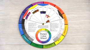
You can get hold of one for a few quid online.
If you have a look at the back side of the wheel you will see your pure colours around the outer edge. Let’s start with the primary colours red, yellow and blue. Well I’m sure we all remember this from school! Your secondary colours, green, orange and violet are what you get when you mix two of the primaries together.
The ones in between are your tertiary colours – so red-orange, yellow-orange, yellow-green, blue-green, blue-violet and red-violet. Just seeing these set out on the colour wheel can help you when organising and choosing schemes. But there’s more!

It’s worth bearing in mind that you have a cold half and a warm half to the colour wheel. When you’re putting together a scheme for a room, you might want to consider this according to the mood you’re trying to evoke. It may be that the room feels a little cool, for example, so needs a colour from the warm side.
It makes a lot of sense as the colours yellow, red and orange remind us of the sun and fire, whilst blue, green and violet direct us to water.
Analysing analogous
If you’re a little nervous about using colour, you might want to stick to an analogous scheme. 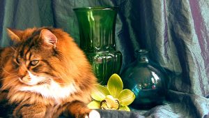
You want to use at least two of these colours but no more than five, otherwise you lose the harmony.
This is a safe way to use colour, but you might want to live a little once you’ve dipped your toe in! I’ll show you how you can do that in a moment.
P.S. the brown of my cat Dexter is not included in this analogous scheme – but you trying telling him that!
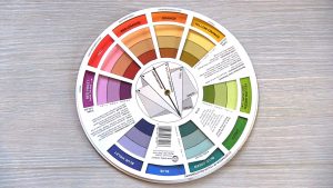
When you mix a pure colour with white it gives you a tint of that colour. Mix it with grey and you get the tone. The shade is what you get when you mix it with black.
The wheel indicates the end result of these combinations if you look down towards the centre of the wheel.
If you just use the tint, tone and shade of a colour it’s known as a monochromatic scheme. This can look really fantastic, but you might want to add a pop of colour, which brings me to….
Trust me, you will thank me for introducing you to this section! It’s when you start experimenting with the complements of a colour you get the wow factor.
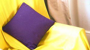
A colour’s ‘complement’ is opposite it on the wheel. My favourites are red-orange and blue-green, or yellow and violet. Put these together and what have you got? A real pop of colour! (bibbidi-bobbidi-boo!!!).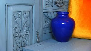
Doing the split
You can also get an awesome effect with a split complementary scheme. This is where you mix the key colour with the two either side of its complement. For example blue-green with orange and blue-violet.

A tetrad has four evenly spaced colours on the wheel. These are bold uses of colour, but if you work with tints, tones and shades of the pure colours you can find more harmony.
Colour me good
There is more to learn but this is a good start.
So now you know how to use a colour wheel, go forth and experiment. Although remember rules are there to be broken – but it helps which ones to break in the first place!!!


Something else to think about is the feeling you get from certain colours, so it’s worth checking out my colour psychology post.
Why not subscribe for free so you never miss a post or video?
For daily posts and live demos come and chat with me on The Home Genie TV Facebook page.