Ad. How To Use A Colour Wheel
This is a guide to using a colour wheel, if you can’t view the video, please click here.
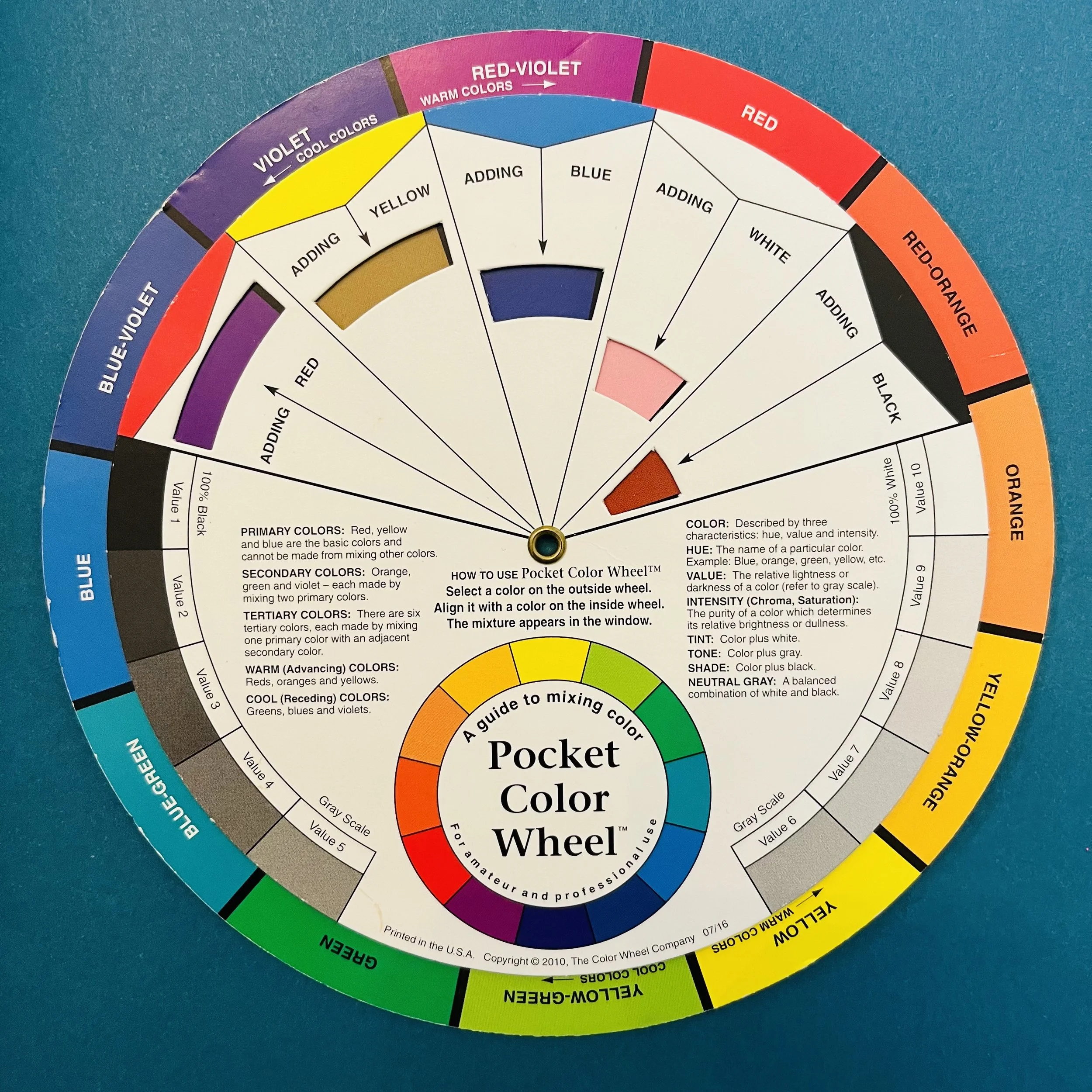
Introducing the colour wheel
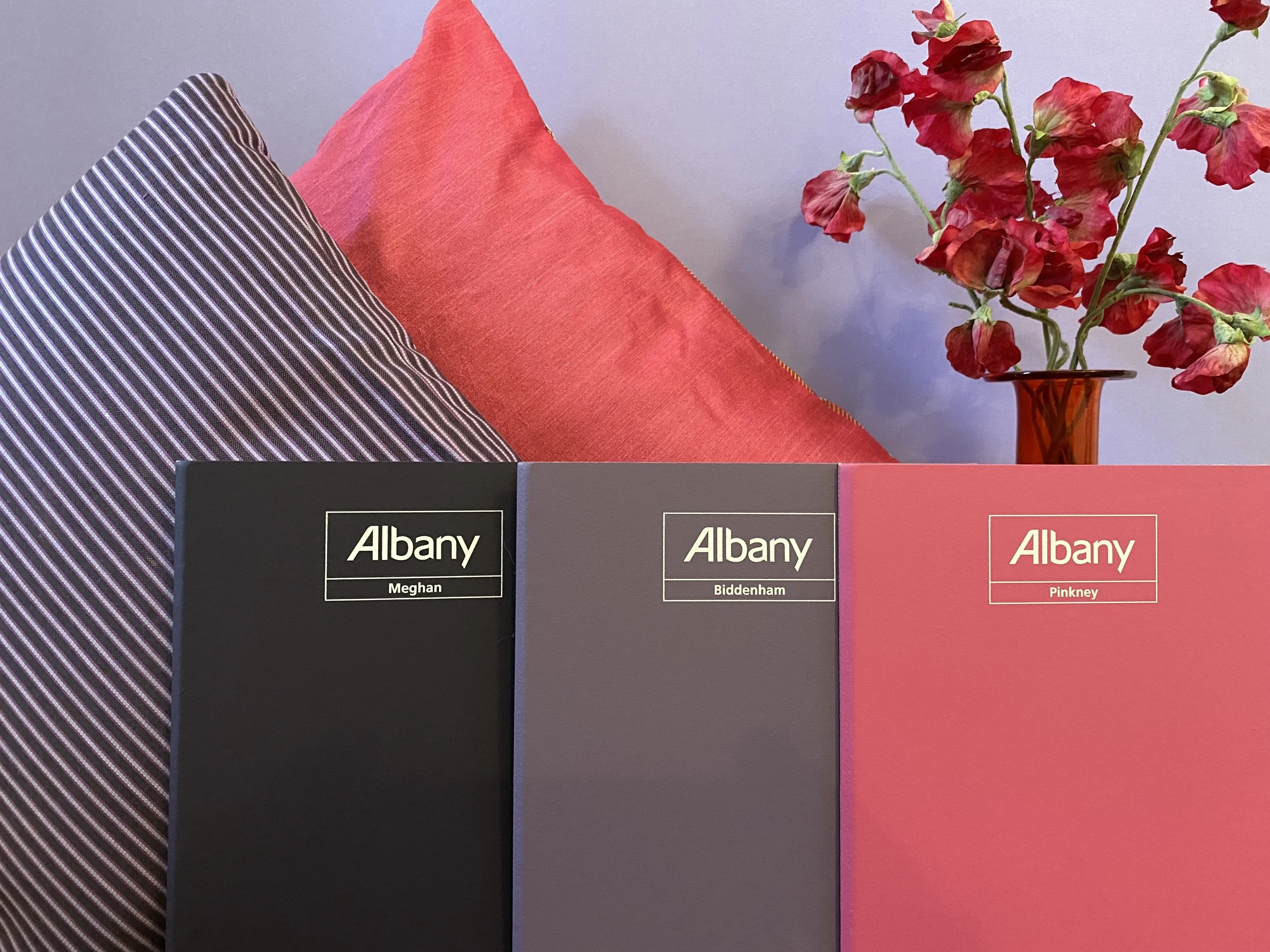
So you’ve popped to your local Brewers, you know what your favourite colour is, but what do you put with that colour.
Let me introduce you to this little fella called the colour wheel, the best invention known to man… well when it comes to interior design anyway!
When choosing a colour scheme it can be stressful to know where to start, but you don’t need to be an expert.
Let’s take this step-by-step.
Remember learning your primary and secondary colours of the rainbow at school - red, orange, yellow, green, blue, indigo and violet?
Well it’s very rare you will just use these in interiors. More desirable effects are created when you incorporate tertiary colours and introduce black, white and grey, which I’ll come to.
Your wheel shows how these colours sit next to each other, so you can get your ducks in a row to start.
Too hot to handle!
Firstly you need to think about the temperature of your colour.Your wheel will help you with this as one side is hotter – the reds, oranges and yellows whilst the blues, greens and purples are colder.
This is important because the temperature of a colour affects how you perceive it.
Warmer colours are more attention grabbing and energetic. Their cooler buddies calm things down a bit - all important for creating the right mood for a particular room.
Science of styling
When it comes to deciding on a scheme for a room, there is a science to all this. This is probably good news if you’re not the most creative of people.
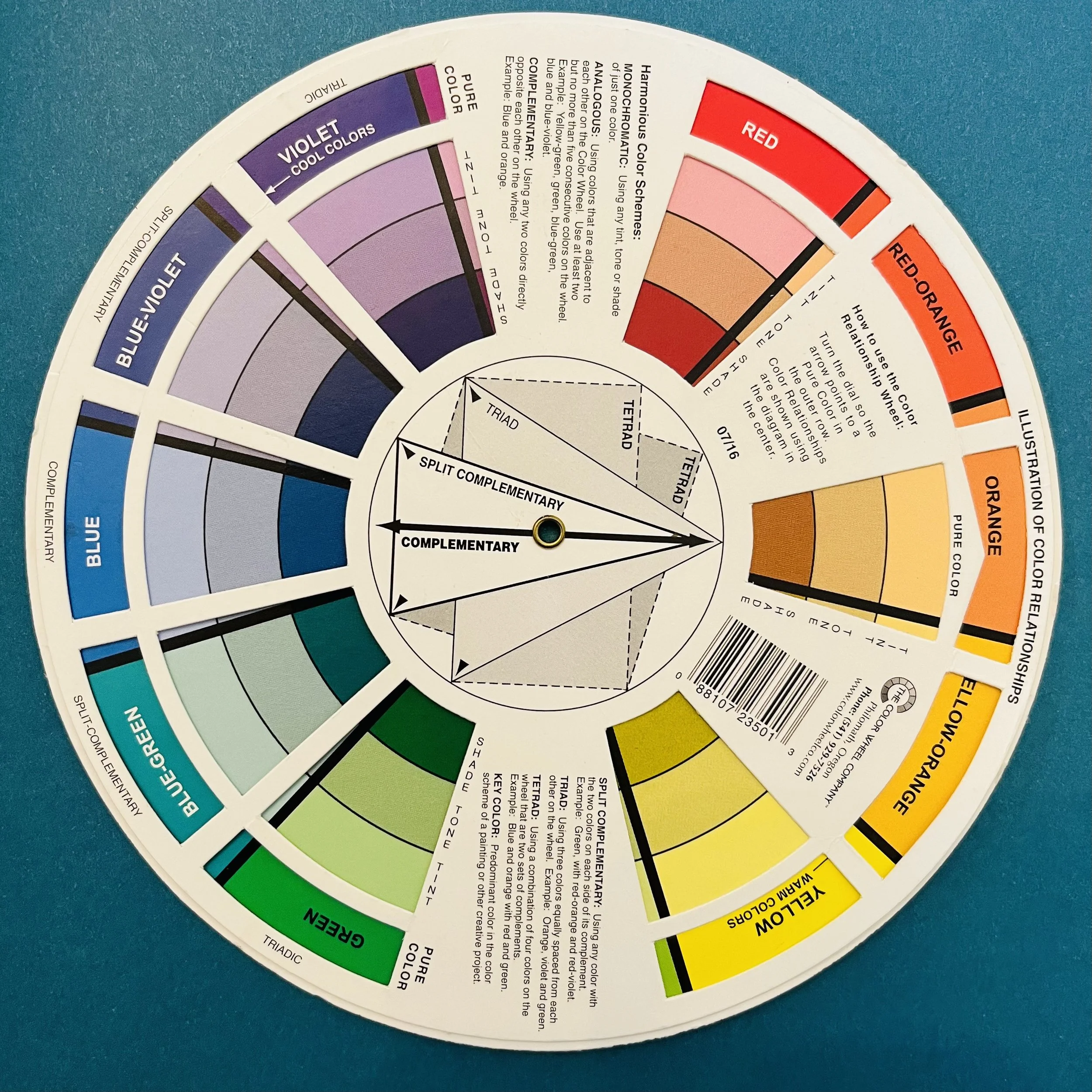
I’m going to focus on the 3 simplest schemes, starting with monochromatic.
I talked about pure colours earlier, but if you add white you tint it, if you mix it with grey you get a tone and the addition of black gives a shade.
If you use tints, tones and shades of a pure colour you can create quite a funky monochromatic scheme. Just be careful to use the same hue.
For an even more harmonious result have a go at analogous colours.
These are next to each other on the wheel – so think a primary blue, tertiary blue green and secondary green.
As these flow effortlessly together so will the interiors of the room.
If one colour is a little bright, you will find the adjacent one will calm it down a little, making it easier on the eye.
I’m a big believer that opposites attract, so I love to mix complementary colours. These are opposite each other on the colour wheel and can really inject energy into a room.
My favourites are blue green and red orange.
So you see, when you're choosing colours it doesn’t have to feel like you’re reinventing the wheel!